Program Mapper
Client: The California Community Colleges Chancellor's Office
Date: September 2017
Programs: Sketch, InVision, Zeplin
Duration: 10 Months
Client and Project Overview:
The California Community Colleges System comprises 114 community colleges and is the most extensive system of higher education globally, with more than 2.1 million students. Academic Affairs, within The California Community Colleges Chancellor’s Office, is responsible for providing curriculum guidance and overseeing instructional operations. They seek a clear visual representation of the course sequence and progression and keeping students on track for graduation. To accomplish these goals, the Chancellor’s Office is interested in leveraging guided curriculum pathways.
The central pillar of guided pathways provides students with relevant information and management about curriculums. It identifies specific course sequences, milestones, and learning outcomes with objectives. One way to clarify paths for students is to simplify institution and program exploration through visualizations. For administrators and faculty, the Program Mapper pathway tool will enable the ability to customize content and update pathways throughout the year, keeping students informed and successful.
Objectives
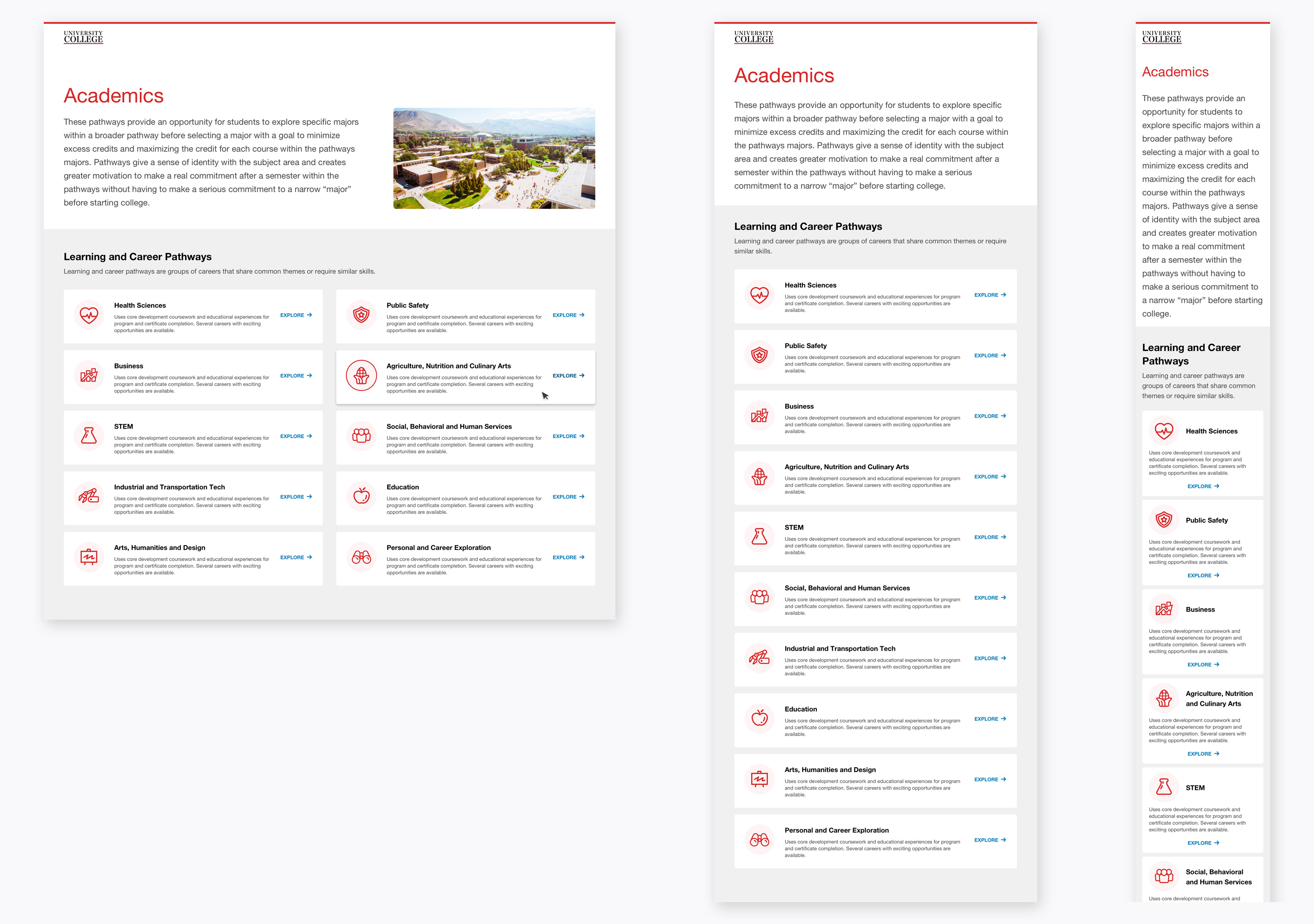
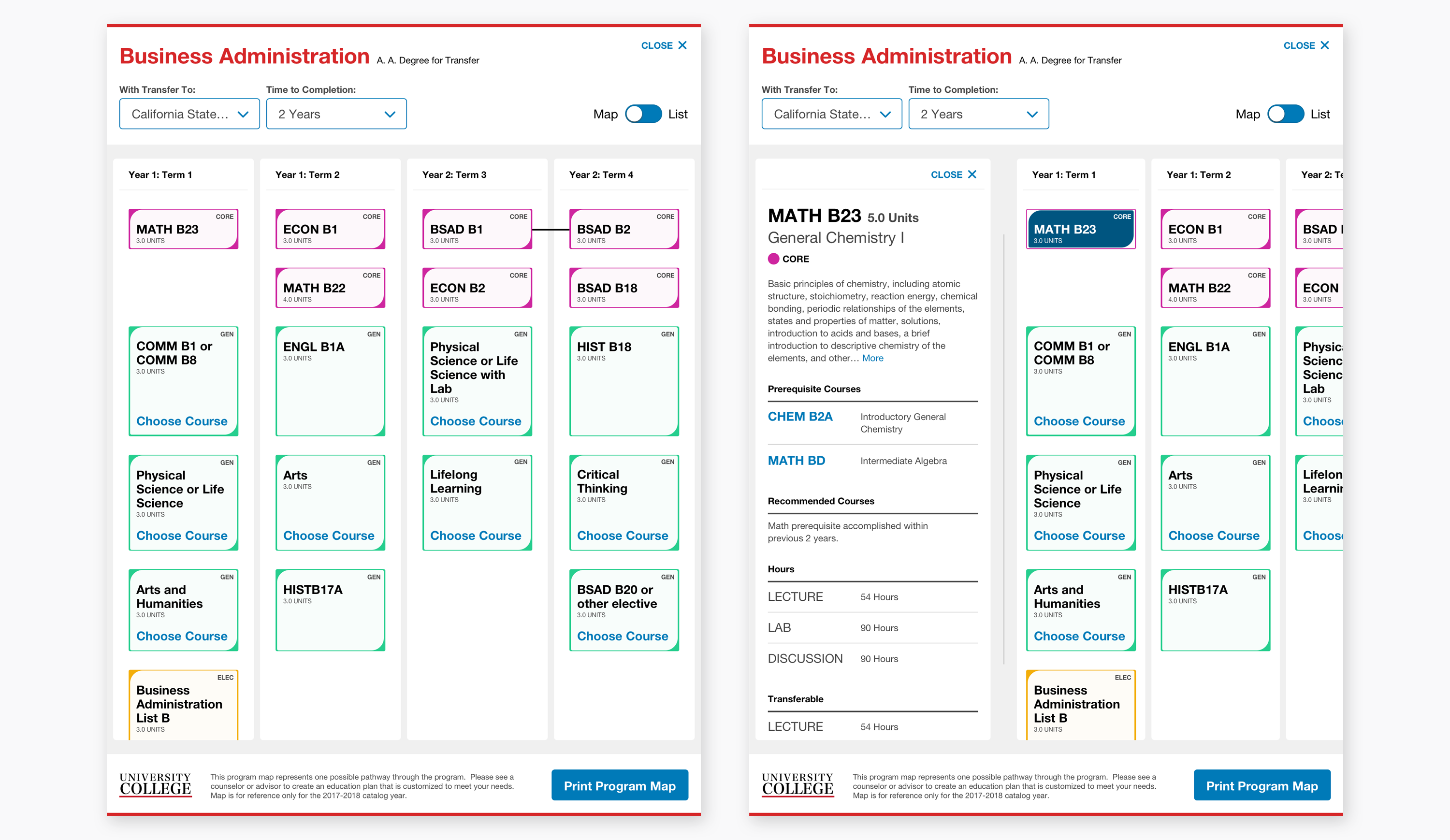
The main objectives of Program Mapper are to implement visualizations of course catalogs utilizing an agnostic tool that acts as a seamless extension of college brands and experiences and provide additional informative career details. It needs to deliver complex academic content such as programs, course order, prerequisites, transfers, and part-time attendance in a consistent visual language.
Project Objectives:
- View class matriculation through visual pathways
- Track and explore course details and essential programs
- Update pathway viewing options: part-time options and university system transferability
- Explore career salaries and growth rates related to different pathway options
- Control the theme of the site though colors and images
- Satisfy the requirements of WCAG 2.0, level AA
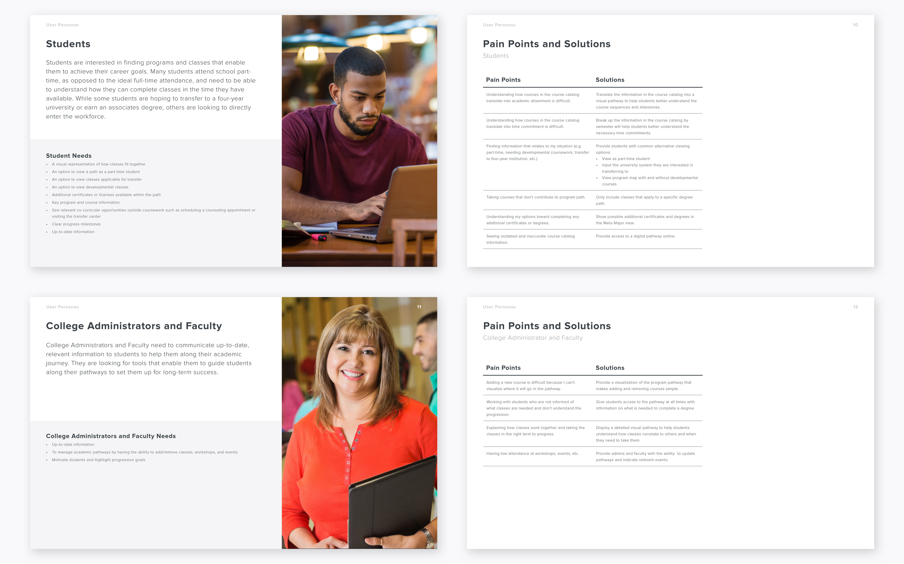
Researching the two main user types for Program Mapper, I created fictional personas to understand users’ needs, experiences, behaviors, and goals. To take this a step further, I identified specific pain points and solutions of each user to achieve the project objectives.
Key Perceptions:
- Empower students to understand their choices better
- Provide an improved experience over the printed, list only view of the course catalog
- Address academic needs while being approachable and encouraging
- Encourage interaction and exploration
- Create a sense of excitement and possibility
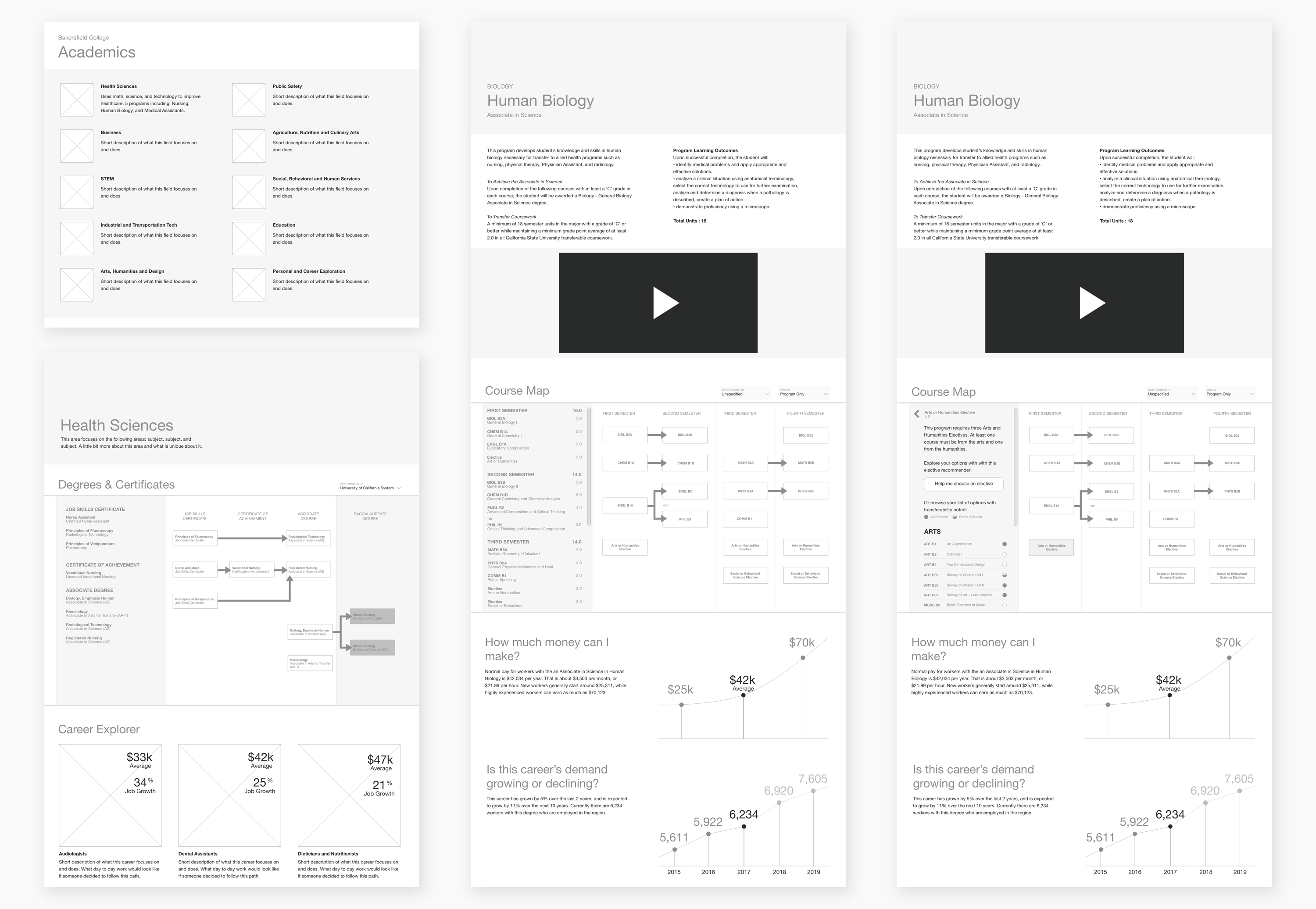
Wireframes were created to map out the functionality of the pages, catch and plan for problems early, and save time on revisions later.
Design Exploration
I approached designing the Program Mapper tool by dividing it into two targets, the container that focused on career info and guided the user to the pathway, and the interactive, pathway-based visualization of the traditional course catalog... The design accomplishes this through a clear hierarchy, straightforward language, and a structure that encourages interaction and exploration. Ultimately, Program Mapper will improve the student experience of course planning, certificate, and degree exploration at community colleges.
Proin ut aliquet nunc, vitae ultrices erat. Vivamus a quam convallis enim consectetur tincidunt consectetur adipiscing elit. Nam facilisis, quam eu vulputate pretium, nibh nisl dapibus justo.
Cras auctor ut metus nec posuere. Ut ligula tortor, auctor in maximus non, porttitor a libero. Donec id viverra arcu. Integer eget facilisis arcu, a accumsan velit. Duis volutpat dui ac magna tristique, ac maximus odio pretium.
Final Design
Every page and component was designed to be fully responsive on any device. To optimize the program map's intricate pattern for optimal user experience, I used custom breakpoints.
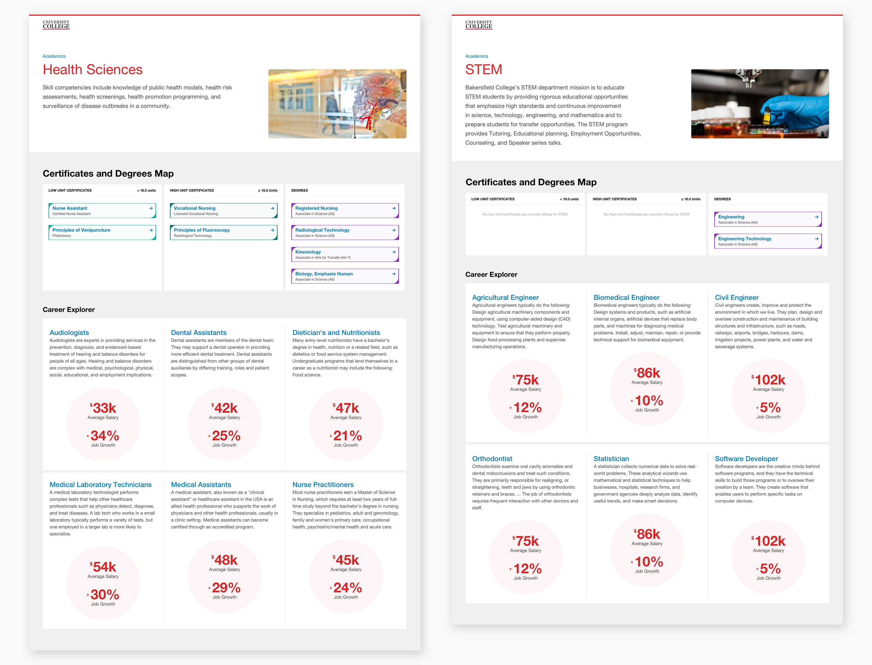
The next step on the user journey is the interest cluster page. In establishing the site's design language, I created large, info graphical visuals allowing the user to explore career salaries and growth rates related to different pathway options.
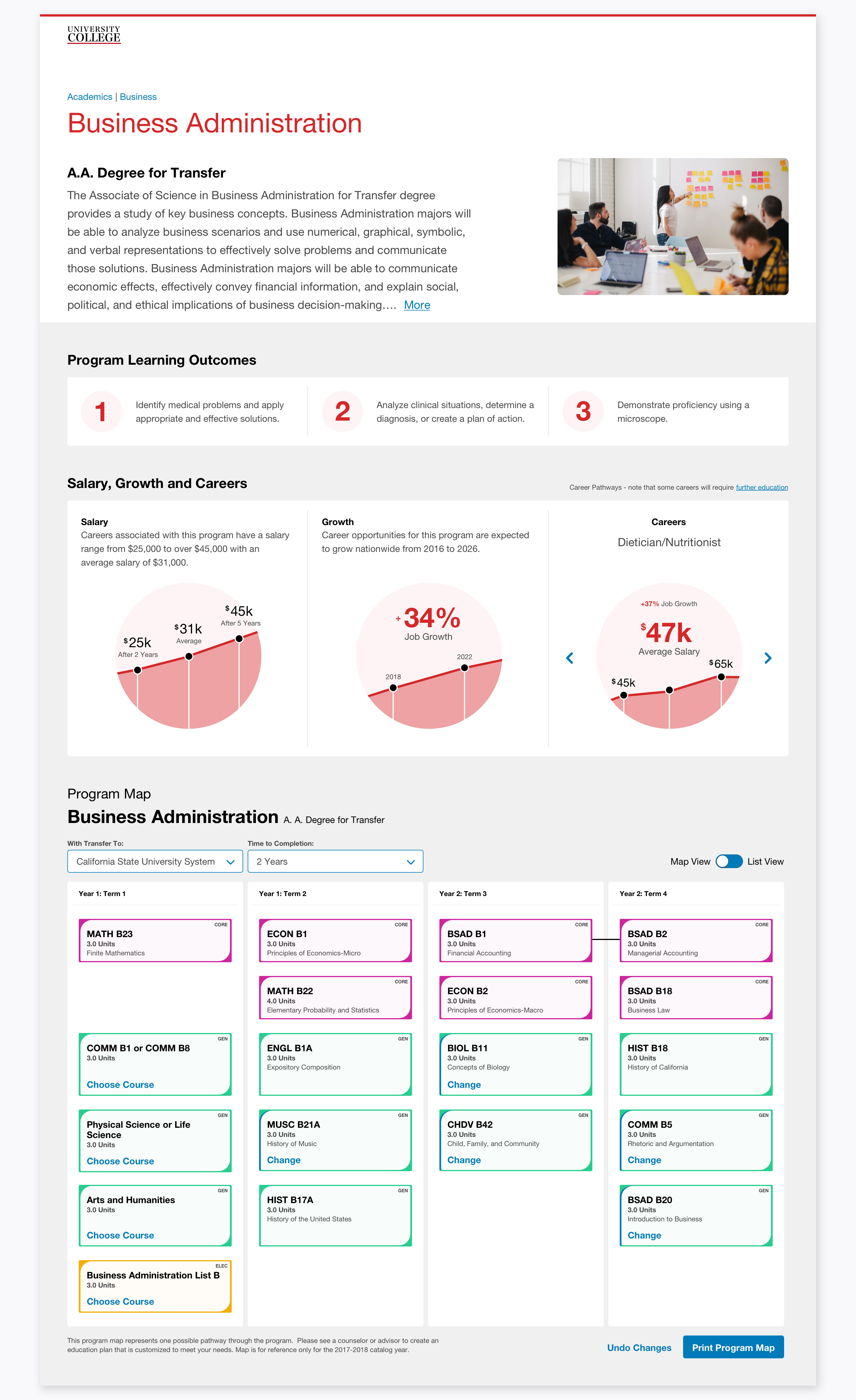
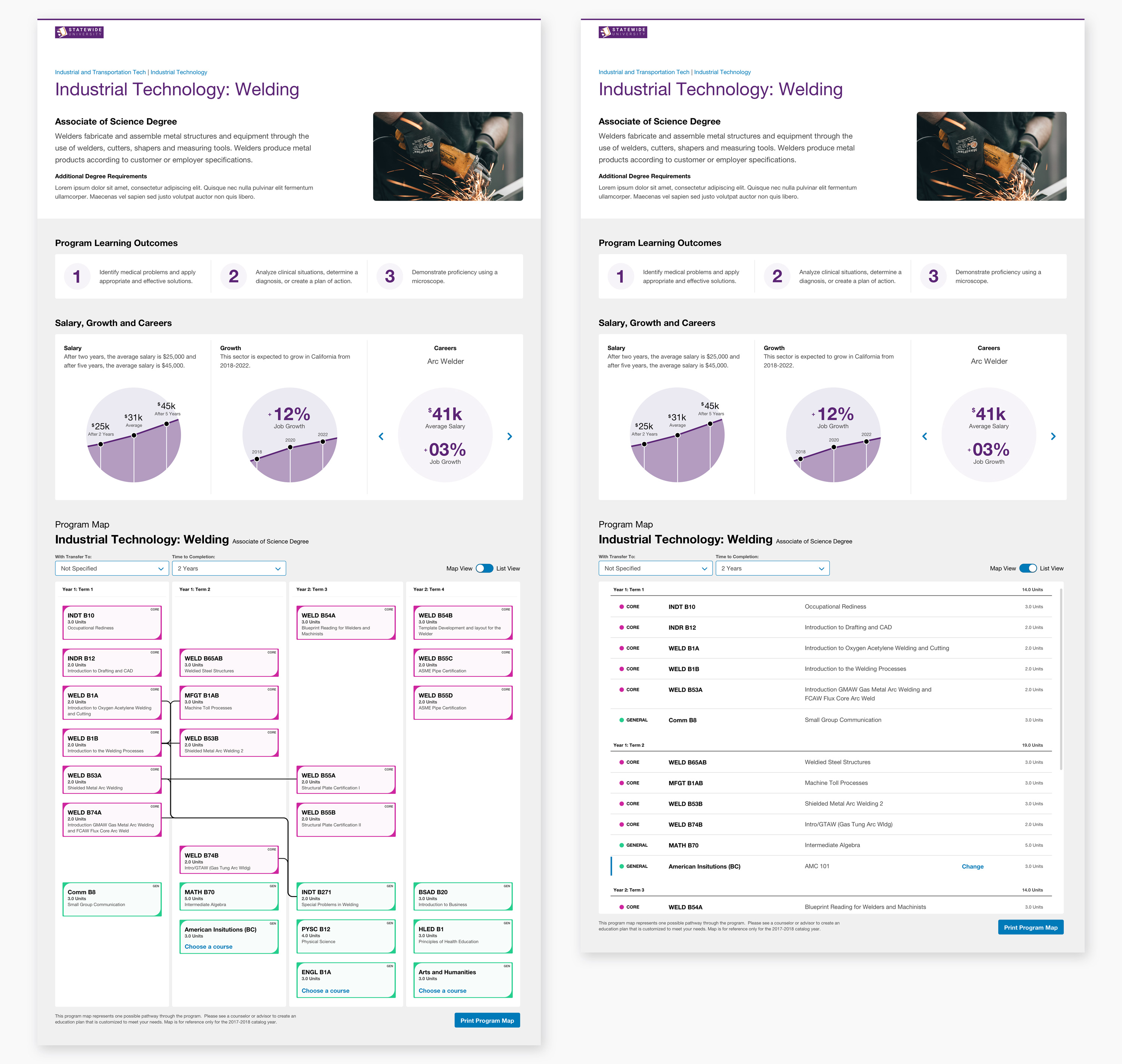
The interactive, easy-to-navigate map that visually represents the pathway of a degree encourages the user to view class matriculation almost subconsciously, even when the pathway is complex. In the map, I designed cards with identifiable colors and carefully crafted a hierarchy of information for quick viewing. The design was created before the height of issue tracking software products.
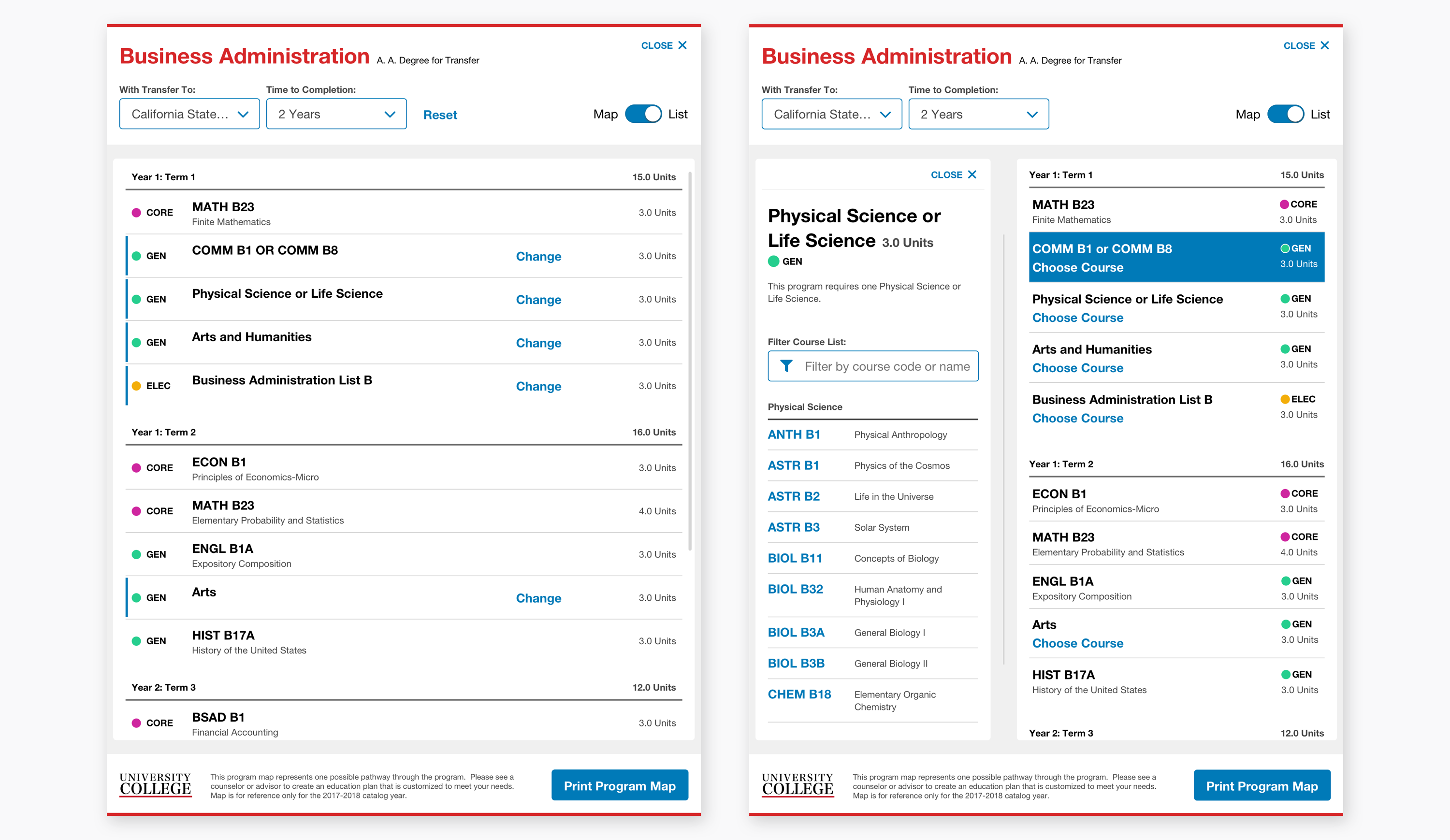
To explore the degree program on devices smaller than a desktop, the map is placed on a separate page to optimize for touch. For tablet, I updated the design of the header and footer, keeping the map centered with compact cards.
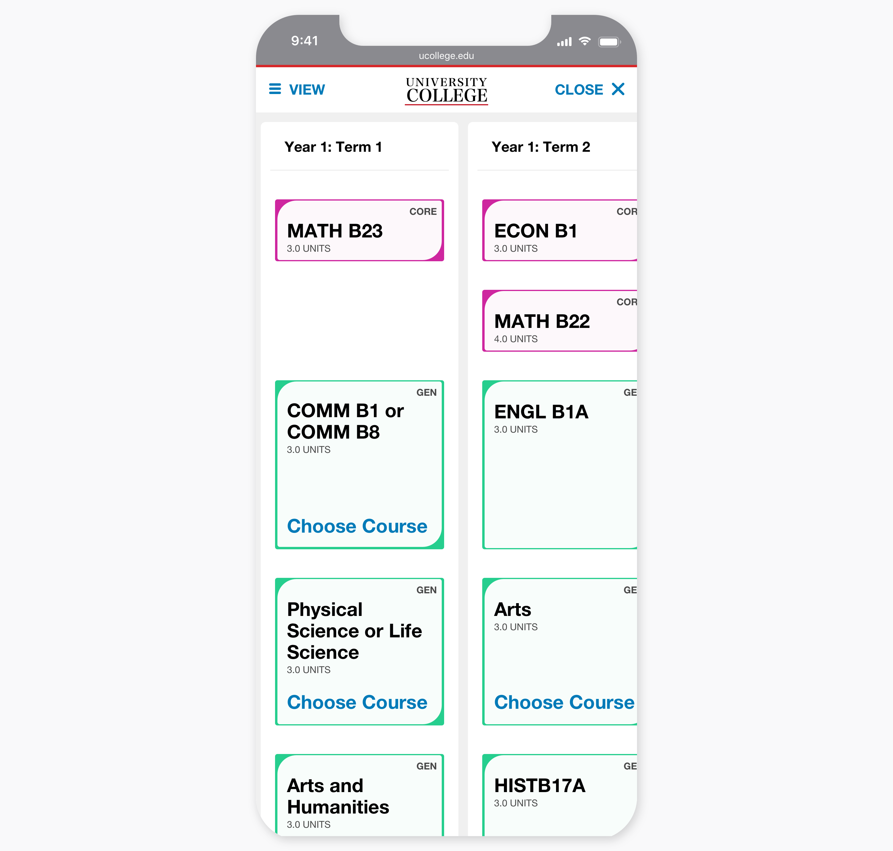
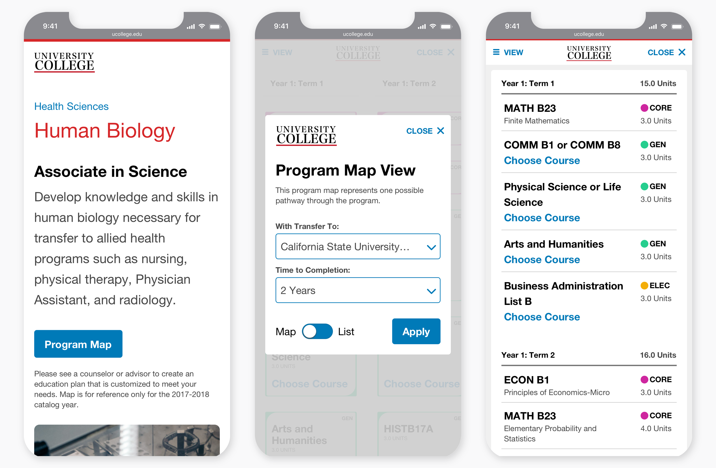
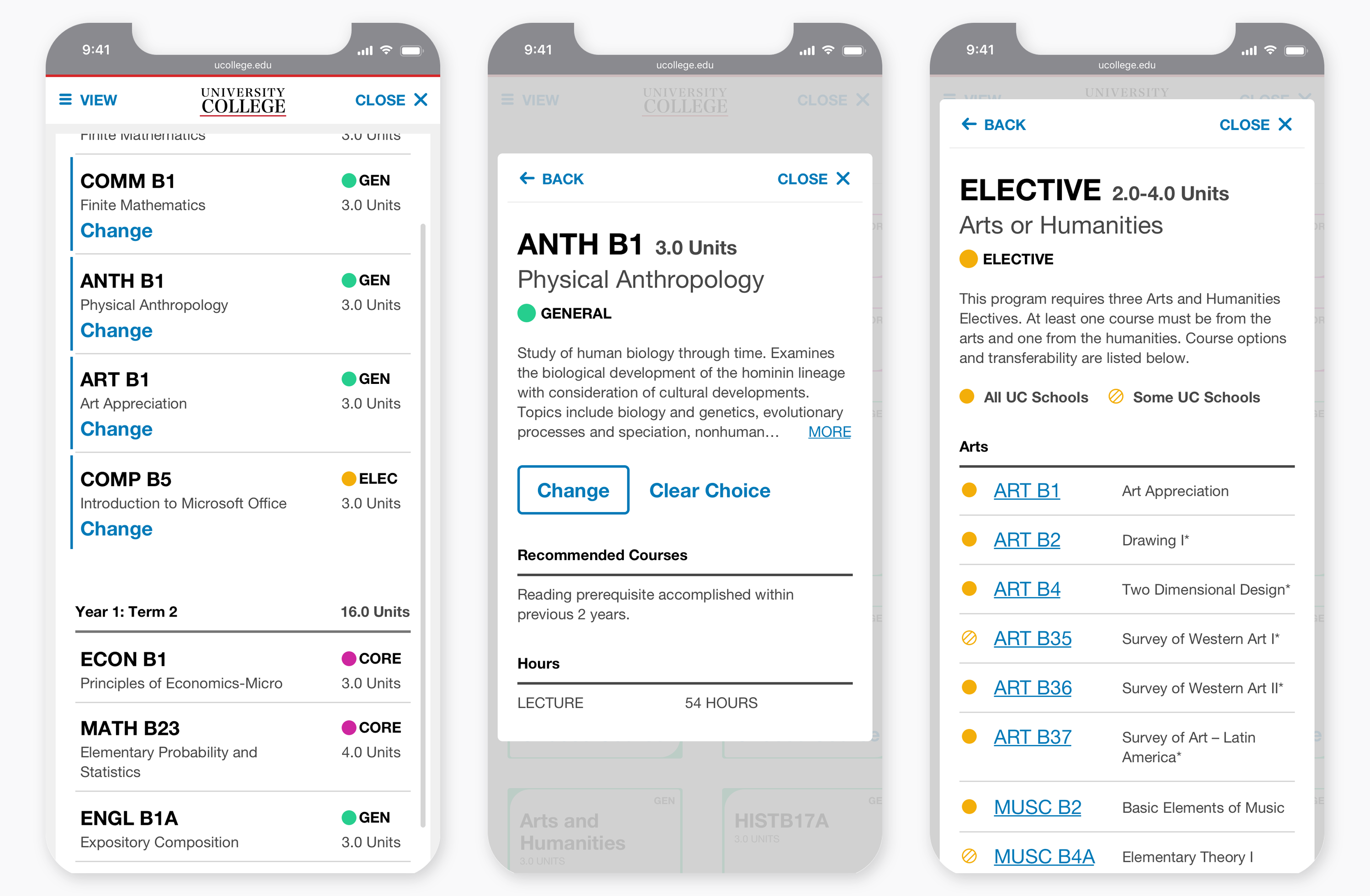
The experience on mobile is similar to tablet, with steps presented sequentially. The design language is consistent but uses layered cards for class details and selections.
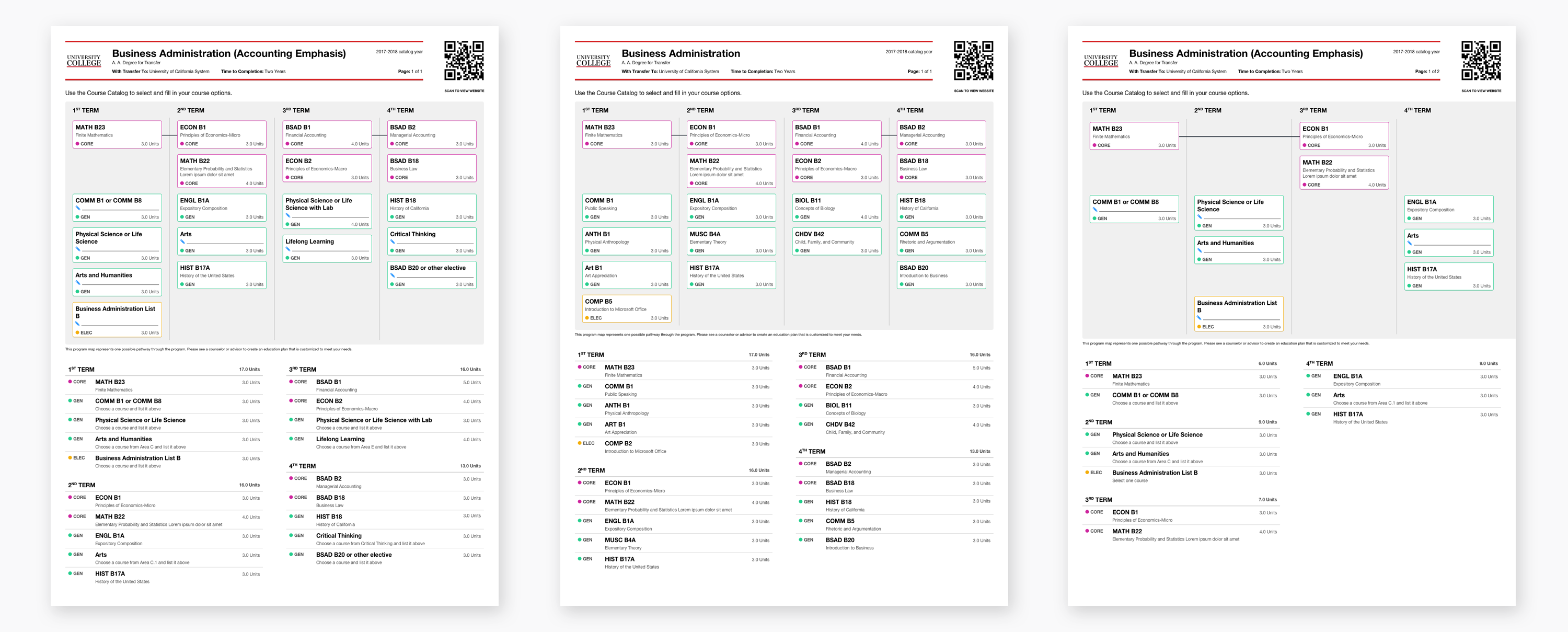
The pathway maps also required the ability to be printed. To accomplish this, I translated the design language to resemble a worksheet while maintaining consistency with the site. I also included a QR code for the user to quickly find the map's origin.
Design Guide
Lorem ipsum dolor sit amet, consectetur adipiscing elit. Aliquam tristique lorem vel ex pharetra, non dignissim nulla sagittis. Cras id diam ac orci iaculis facilisis semper a ex.
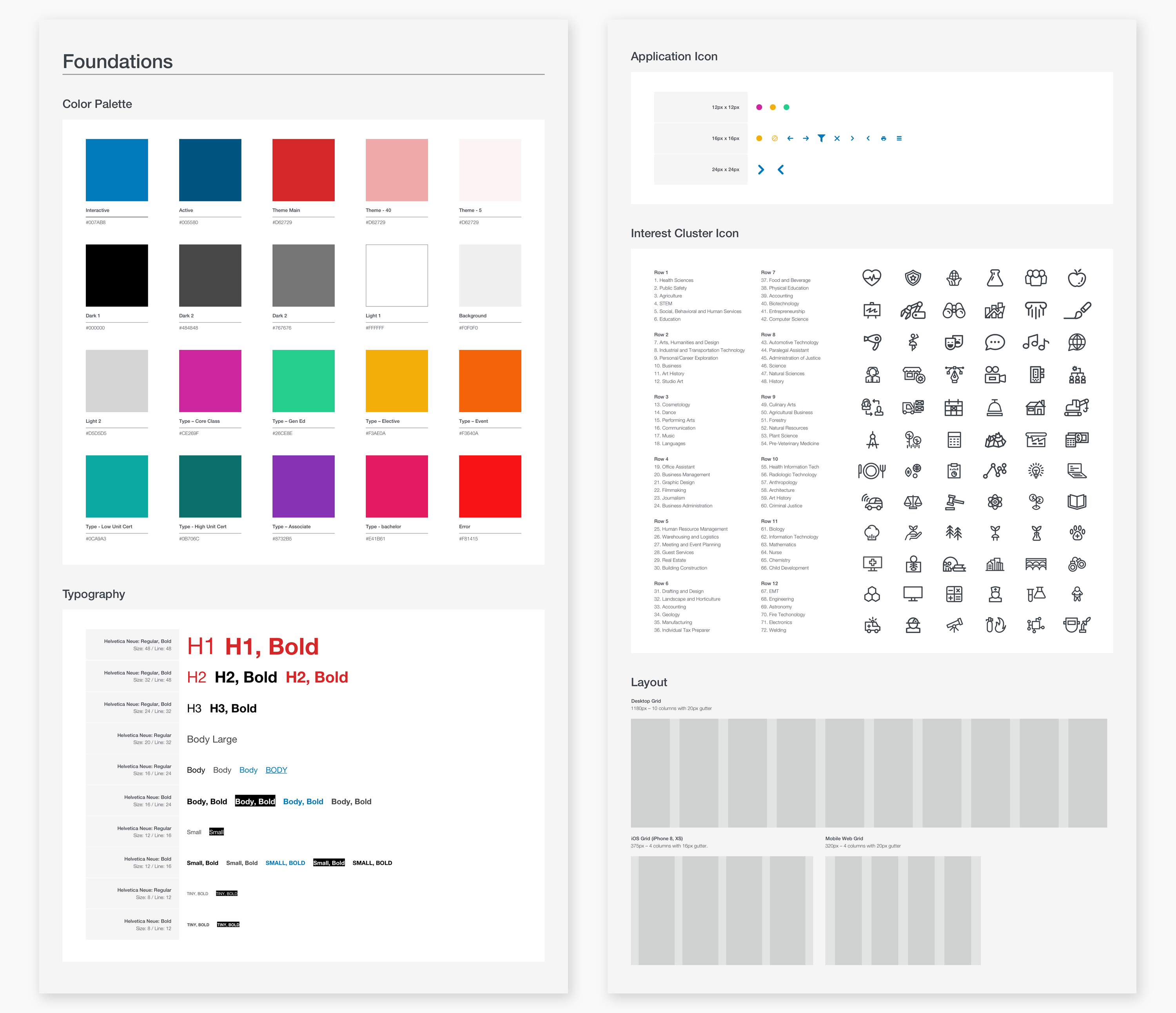
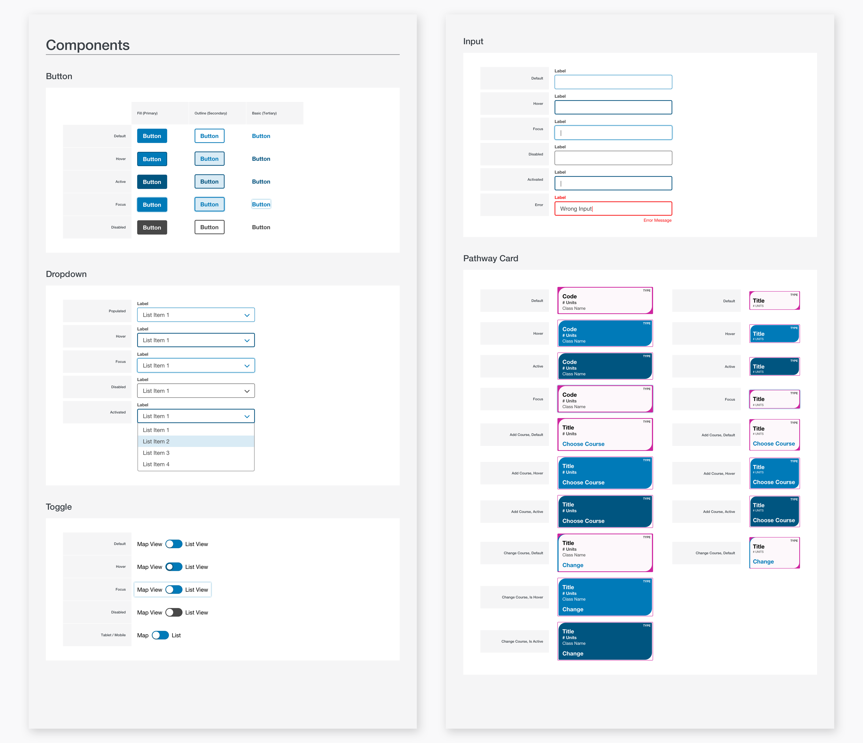
Design System Guide Lorem ipsum dolor sit amet, consectetur adipiscing elit. Aliquam tristique lorem vel ex pharetra.
Outcomes
The Program Mapper Tool is currently in its second design and development phase. Early user focus groups, high schools and college faculty have shown great interest in this product. It has also received praise from various college presidents and from the Executive Vice Chancellor of The California Community Colleges Chancellor’s Office.
Incorporating Feedback Lorem ipsum dolor sit amet, consectetur adipiscing elit. Nam facilisis, quam eu vulputate pretium, nibh nisl dapibus justo, et tristique nunc nibh interdum augue. Phasellus luctus, augue et consectetur lobortis, quam augue pulvinar lacus, at euismod magna purus et erat. Proin ut aliquet nunc, vitae ultrices erat. Vivamus a quam convallis enim consectetur tincidunt.
Retrospective
This UI design was the second iteration of a first release in an agile work environment. Given more time I would flush out additional theming possibilities and functionality. With more theming the design could have felt more unique across different colleges.