Design Methods
Medhtods are how you do something.
Design methods are procedures, techniques, aids, or tools for designing. They offer a number of different kinds of activities that a designer might use within an overall design process.
Atomic Design
Atomic design is a methodology that allows (and requires) you to describe and organize every component of your design system. This approach divides design components into 5 different categories.
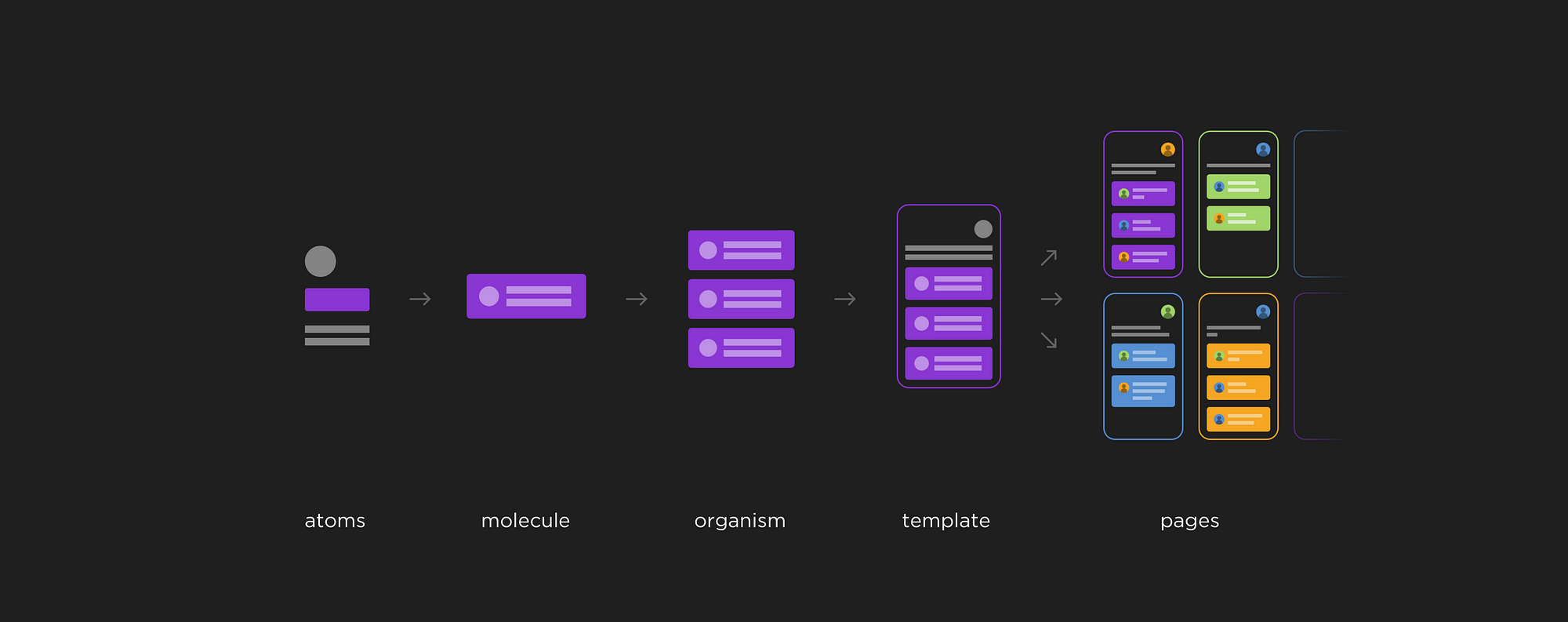
1. Atoms:
These are the smallest building blocks; individual legos. These elements cannot be divided into smaller parts without losing any use (ex. a button needs a label or icon).
- Includes: typography (text styles), colors, buttons, icons, input fields, checkboxes, radio buttons, dropdowns
2. Molecules:
These are more complex entities consisting of several atoms. Molecules are already functional elements that could be put anywhere on the page and work on their own. Usually they need to be a part of an organism, to truly have a value.
- Includes: notification toasts, data values (label: value), input fields with buttons
3. Organisms:
Truly functional parts of a page, made from groups of atoms and molecules. Many organisms function on their own, without relying on other elements on the page. They are usually huge components. Organisms can become quite sophisticated and have smaller organisms inside.
- Includes: navigation, sidebars, forms, popups with lots of data
4. Templates:
Pages without real content. They combine organisms into a proper website layout.
5. Pages:
Once you have a template, you can create pages from it by adding content.
↝ References: Building Design Systems with Atomic Design, Design systems — in the wild
Design Systems
A design system unites product teams around a common visual language. It reduces design debt, accelerates the design process, and builds bridges between teams working in concert to bring products to life. Learn how you can create your design system and help your team improve product quality while reducing design debt.
Into to Design Systems
- The more reusable the components are the less you need to maintain, and the easier scale becomes
- Needs to have a shared source of truth
- The design system needs to document all aspects of the system including the components, guidelines, and UX best practices
Designing the Design System
- The visual design language will be the foundation of the UI library
- The Design System team model
- The solitary model: an overlord rules the design system
- Pro: Speed and scrappy
- Con: overlord can become bottleneck
- The centralized team model: a single team maintains the design system as their full-time job
- Pro: keeps system well maintained
- Con: may not be as connected to customer needs
- The federated model: team members from across the company come together to work on the system
- Pros: insight into what is needed for all products
- Con: group can get busy and not update system
- A hybrid model: elements of different models. Common is a hybrid of federated and centralized
- The solitary model: an overlord rules the design system
- Will get used much more often if created to fit into the workflow of teams
- Two types of interface inventories
- Visual attributes (spacing, color, typography) to create a visual language
- UI Elements (buttons, cards, modals) to create a UI Library of components
- Visual design language
- Colors, typography, spacing, images, possibly visual form, motion, sound
- Color is used to convey feedback, information, and hierarchy
- Type leading – a general rule of thumb is to have leading at around 1.4x to 1.5x the font size. 1.5x is recommended by W3C WCAG 2.0
- Heading can often be less 1.25 or 1.125
- Spacing and sizing – patterns and proportions
- Setting a base and scaling proportionally
- 4-base scale is growing in popularity with responsive math
- Icons could have different styles as well as meanings ie. Utility icons, Action icons
- Illustrations can be documented as well
- Motion in design systems – have a simple video of how they are implemented
- The user interface library is the components (pattern library)
- UI design system parts
- elements (or basics, or atoms)—these are small, stand-alone components like buttons and icons
- components (or molecules, or modules)—these are usually an assembly of small components into a larger component like a search form (which includes a form input, a button, and potentially even a search icon)
- regions (or zones, or organisms)—these are an area of the UI like a left-hand navigation
- layouts—how the pieces are laid out on the page (like a header region, followed by a sidebar and main content area, followed by a footer)
- UI design system documentation includes components name, description, example, and code. Optional: meta data, release histories, examples
Building Design Systems
- The system is a living, breathing system that is flexible, maintainable, stable, scalable and successful in the long run
- It's consistent - The way components are built and managed follows a predictable pattern
- It's self-contained - Your design system is treated as a standalone dependency
- It's reusable - You've built components so they can be reused in many contexts
- It's accessible - Applications built with your design system are usable by as many people as possible, no matter how they access the web
- It's robust - No matter the product or platform to which your design system is applied, it should perform with grace and minimal bugs
- Consistency
- Define the rules of the system with documentation and ensure everyone follows them
- Code style guides – how code is displayed in the style guide, tool exist
- Self-contained
- Design system should live in a source control repository independent from the main codebase
- Reusable
- Components need to be modular, compostable, generic and flexible
- It's consistent. The way components are built and managed follows a predictable pattern.
- It's self-contained. Your design system is treated as a standalone dependency.
- It's reusable. You've built components so they can be reused in many contexts.
- It's accessible. Applications built with your design system are usable by as many people as possible, no matter how they access the web.
- It's robust. No matter the product or platform to which your design system is applied, it should perform with grace and minimal bugs.
- Components need to be modular, compostable, generic and flexible
- Accessibility
- Start to enforce accessibility from the start
- Build components to be keyboard and screen reader accessible by default
- Accessibility guidelines need to be included in the design system
- A simple way could be to add type over colors to see which standard it passes
- Robust
- Foundation of tests – Test your design system instead of your complicated UI
- Tests: Unit testing, Functional testing, Visual regression testing, Automated accessibility testing
- Foundation of tests – Test your design system instead of your complicated UI
- Common challenges
- Maintaining documentation
- Minimize separation between library code and documentation code
- Handling changes
- Breaking change is a situation where necessary changes to a components code will break existing usages of that component or class
- Wrong way: duplication – an updated version might not be adopted if both exist
- Right way: versioning – adopters can target a version, this requires release notes
- Versioning Convention: Major.Minor.Patch
- Major versions (1.0.0) contain breaking changes from prior versions
- Minor versions (0.1.0) add new functionality that is backward compatible
- Patches (0.0.1) contain bugfixes for existing functionality and are backward compatible
- Versioning Convention: Major.Minor.Patch
- Forward Thinking
- Design tokens – small design atoms that get applied to multiple items, entities that store visual design attributes, use in place of hard code values
- Examples: colors, radius, borders, font, font size. Ect
- Lightning Design System — Design Tokens
- This can also be used for theming – defining different tokens for each theme
- Design tokens – small design atoms that get applied to multiple items, entities that store visual design attributes, use in place of hard code values
- Maintaining documentation
Putting the Design System to Practice
- Two approaches to developing and rolling out design system
- Incremental and large-scale redesign
- Documentation is key
- It’s worth investing time to develop practices to keep it updated
- Document styles as you add them, so a backlog doesn’t develop
- Makers of the system need to stay in touch with those who use it
- Solve Problems and win early adopters
- Improve documentation and findability
- Prioritize the style guide navigation and search
- Person cannot be human style guide search
- Add contextual search: “color” within utilities vs. support variables
- Grow adoption though touchpoints
- Versioning the entire system vs. versioning by module
- Versioning the entire system means everything within the system belongs to just one version
- Versioning individual modules means having a version number for every component or group of styles within the system
- An entire system can include a modular update version
- The option to update either
- Modular can require more effort for initial setup
- Versioning by package enables push updates more frequently
- Modular versioning creates more flexibility
- Releases, branches and version numbers
- Possibility for two branches: Dev branch – work in progress, New branch – individual release
Expanding Design Systems
- Teams can build alignment around components, vision, design principles, process, voice and tone
- Vision
- A vision statement moves everyone toward a common destination
- Clarity and then elegance if possible
- Design principles
- How it was created and how makers would intend for it to be used
- They act as a reusable standard for designers to measure their work
- This can create a system of language used
- Can reduce debating solutions
- Process
- Steps in progress: understand, explore, define, design, build and learn
- Voice and tone
- Writing is an essential part of great design
- Voice generally stays the same, tone shifts according to situations
- Building writing guidelines
- Start with an audit, Define the findings, Get buy-in, find a home, develop
- Vision
References
| Source | Description | |
|---|---|---|
| 1 | Design Systems Handbook | Free online book from InVision |
| 2 | Design Systems | A Smashing Magazine book by Alla Kholmatova |
| Collections | ||
| 1 | Design Systems Repo | A comprehensive and curated list of design systems |
| 2 | Website Style Guide Resources | Pattern libraries, code standards docs and style guides |
| Design Systems | ||
| 1 | Material Design | A very popular design system from Google |
| 2 | Altassian | Altassian's design system and design language |